With the announcement that IE7 will be pushed to the general public via a high-priority Automatic Update, we need to be even more diligent in ensuring our sites render correctly with the IE7 browser.
This is great news for folks who design websites in that it will certainly help move the general Windows home user away from IE6. Businesses will be slower to adopt, but they are always slow to adopt.
For folks who design and maintain websites, we need to check our sites to be certain that IE7 will handle them correctly.
For the most part, where we used CSS hacks, IE7 will both (a) ignore the hack and (b) render the element correctly.
Example:
div.content {
  padding:20px;
  width:560px;
}

* html div.content {
  // used by IE6 and earlier but not IE7
  width:600px;
}
In adjusting its box model (I won't go into the politics of which box model is better or more intuitive, but there now appears to be convergence on the standard) and ignoring the star-html hack, IE7 will render the page as the designer intended. If IE7 had only adjusted the box model and continued to accept the star-html hack values, we would have much more work to do.
Going Forward
Our inline IE adjustments have served their purpose, but we need to move ahead to the preferred method of separating browser-specific values. And that is the use of conditional comments. With conditional comments, we can group our IE6 override values in a separate CSS file rather than clutter the main file with inline adjustments.
I would personally like to see conditional comments adopted by other browser vendors.
A Problem with Zoom
One problem folks may not be aware of is a problem with the Zoom feature in IE7. Unlike IE6, Firefox and other browsers, the IE7 Zoom feature works like a big magnifying glass over the entire page. Images and text all expand together; something, dare I say innovative from the IE team.
The images and text expand together under most conditions. I noticed, however, that background images of the <html> and <body> elements are not expanded or contracted with the Zoom feature. This causes a problem when using faux columns or faux headers.


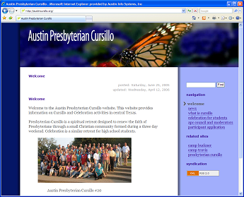
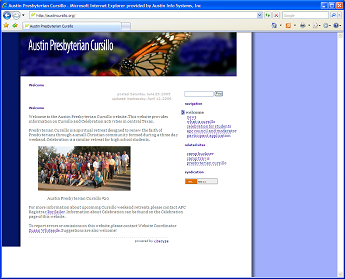
The top screenshot shows how I've used a background image to create the light blue search and navigation column on the right. In the bottom screenshot, all the text and imagery has been reduced, but the faux column remains unchanged. Also curious is that the actual masthead image is much wider than shown in the reduced view, but it has been truncated.
I've entered a suggestion to fix this problem, but it would need a lot of "votes" in order to gain any attention. In the meantime, we will need to move our faux columns to <div> elements inside the <body> tag.

Comments