I'm back to the daily grind after that whirlwind weekend known as South by Southwest Interactive.
I'm a little stunned to read Robert Nyman suggesting that perhaps conferences like SXSW have lost their usefulness. I, for one, don't have to look past my own nose for an example of someone who has directly benefited from the two most recent SXSW conferences. Here's proof:
Update: Since most of these sites have been redesigned, I've adjusted the links to launch screenshots of the sites as they appeared when this blog post was written. We lose the ability to inspect the markup, but trust me, they were horrific. --Carl.
Early Sites
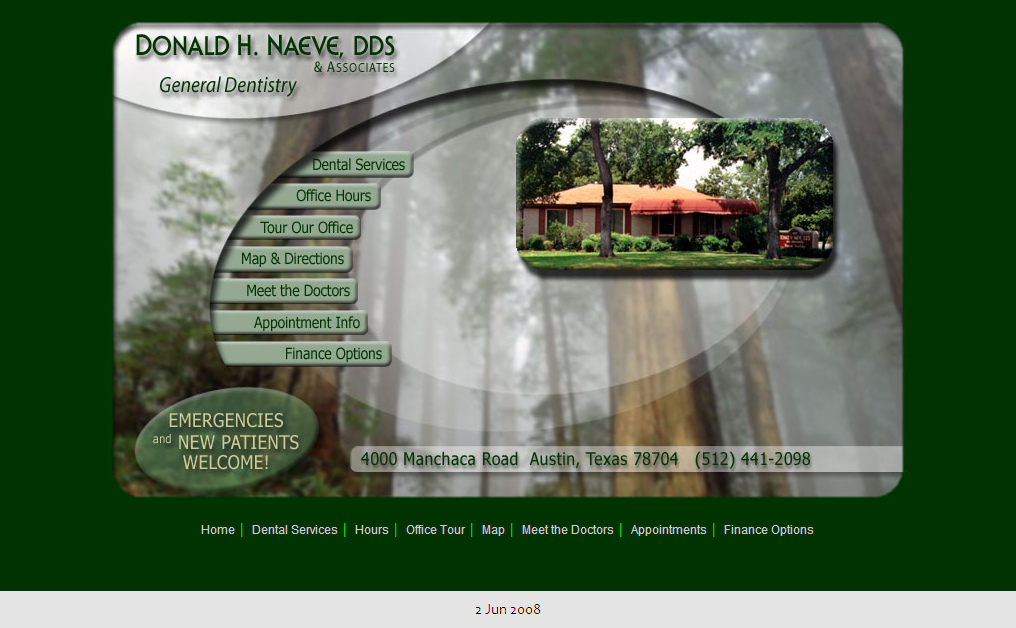
In 2003, I was all table-based and non-semantic.
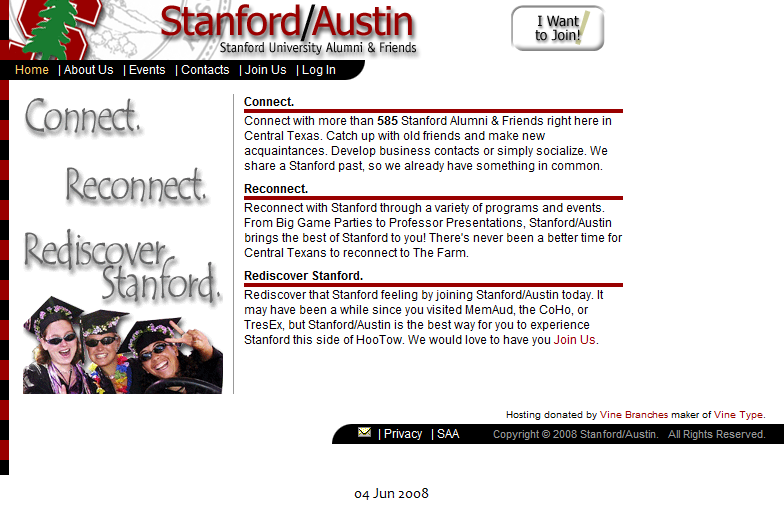
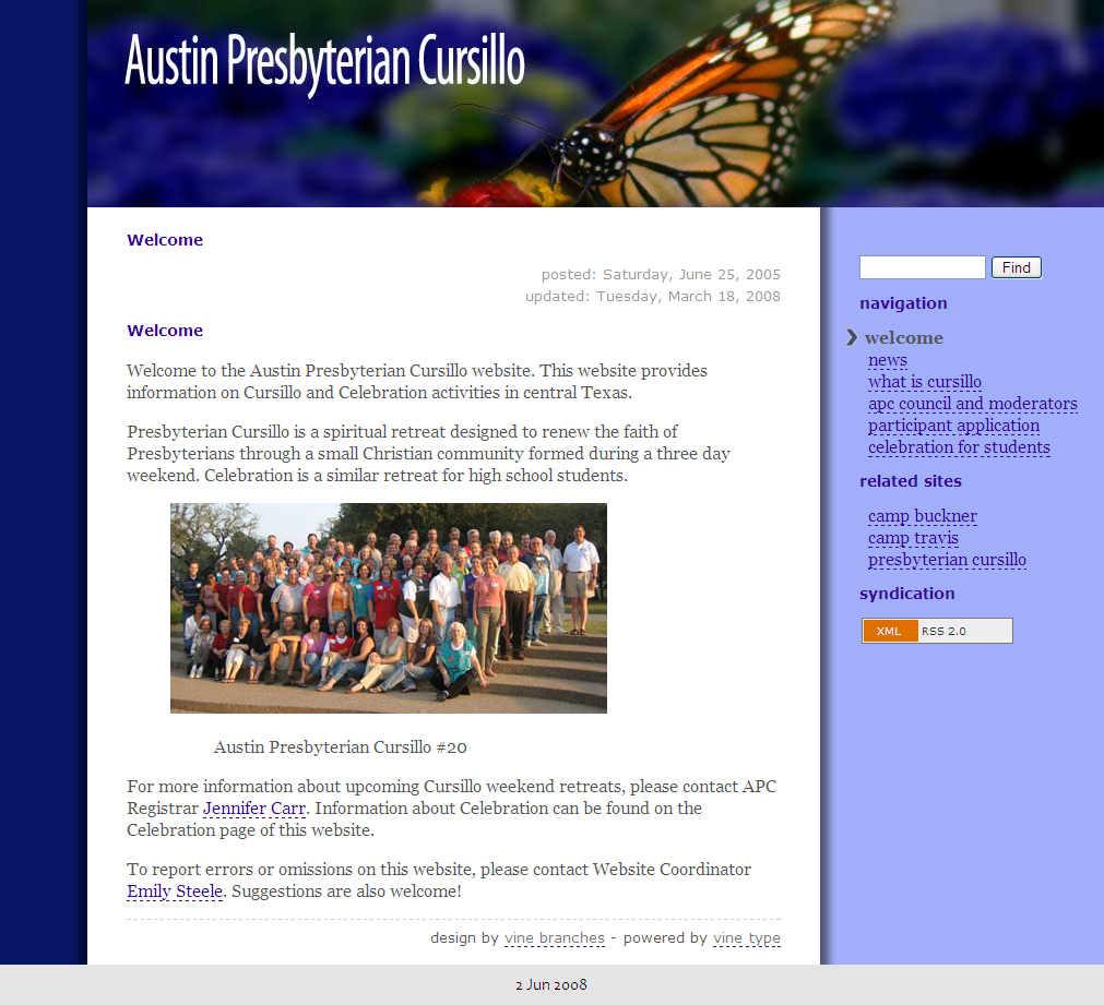
In 2004-2005, I read Zeldman, Meyer, and Cederholm. I caught the CSS and Web Standards bug and began building more modern sites.
The results are okay, but I couldn't figure out what was wrong. They validate. They use CSS for positioning and styling. Still, they didn't feel right and I had no idea what to fix.
Enter Grids
Mark Boulton's Five Simple Steps to designing grid systems exposed me to design concepts I'd never heard of before. It emphasized that the size and position of elements should relate to one another. This concept was reinforced by Mr. Boulton and Khoi Vinh at the 2006 SXSW panel entitled Traditional Design and New Technology.
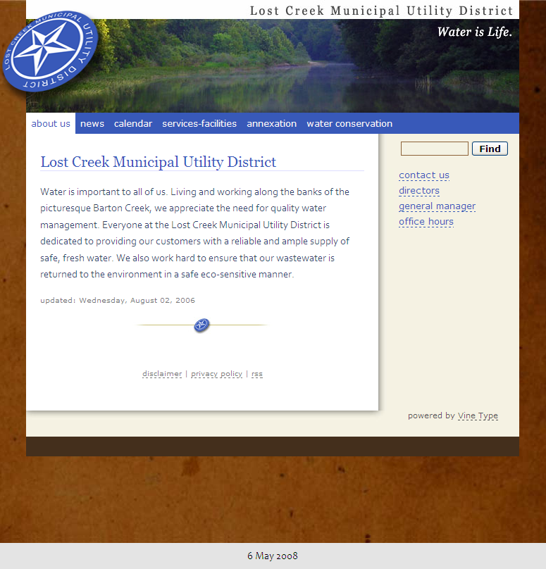
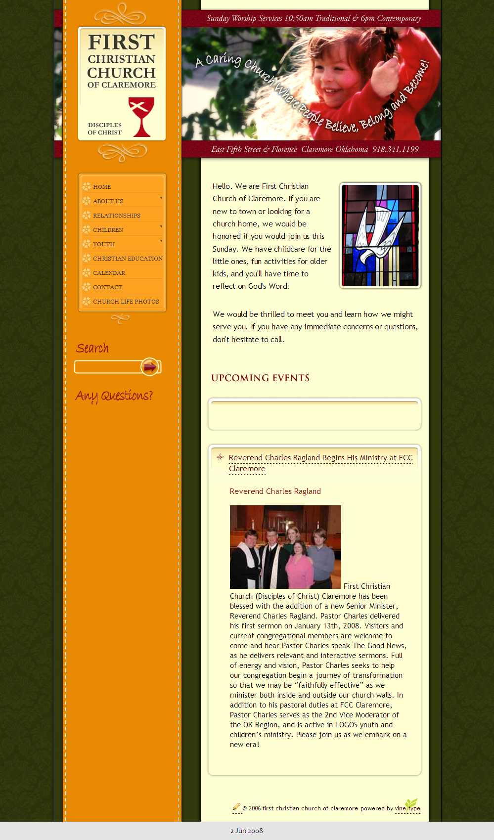
The Claremore site, I think, is a bit uneven in spots and I probably tried too hard. Nevertheless, this represents my first foray into grid-based layout.
Grids Are Good
In 2006, I continued to work on grid-based layouts.
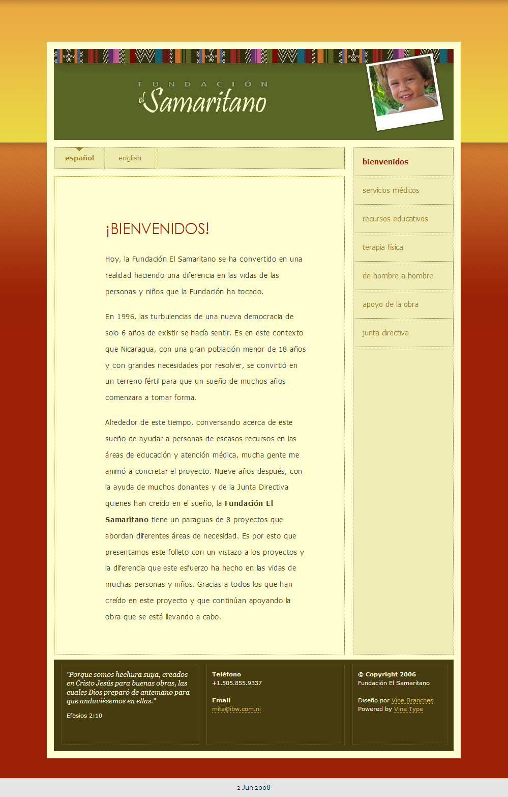
I'm pretty happy with the El Samaritano site. I researched quite a bit trying to find a visual style that says "Latin America" and for the most part not finding any definitive Latin American style other than "use warm colors" so I created the graphic at the top based on a scan of a shirt I bought in Guatemala and featured this site in the Fall CSS Reboot.
Austin Samaritans is a recent site launch -- This time trying not to be too graphical or overly colorful, I tried to "go light" with the palette and typography. Some pages still have placeholder text and I'm tweaking the sidebar but I'm happy with the look.
Next Up: Typography
Grids are firmly in place now. I'm much happier with my designs and my clients are happy too. Early in 2007, I read Bringhurst for a greater appreciation of typography. The importance of typography was reinforced during SXSW 2007 at the Boulton/Vinh presentation Grids Are Good and How to Design with Them and the Boulton/Rutter presentation Web Typography Sucks. There are certainly more levels of design to explore.
That's my story so far. I see progress and I'm happy with the results. Since I don't have any formal training in graphic design, I'm grateful to learn and apply design philosophies.
Furthermore, I can point to specific SXSW presentations as watershed teachings that improved my design aesthetic. So my message here is "Keep the SXSW presentations coming folks!" You most certainly have a satisfied customer in me.


Comments
Stuff is looking better. Typography is definately one of those areas where you'll see the biggest difference.
Thanks for the encouragement, Dennis. Getting a pleasing set of fonts across a website is harder than it sounds.
I too think grid design is overlooked. It's an area I'd really like to improve myself in. :)
I keep waiting for Microsoft to fix their new home page. I find too many things are misaligned and improperly positioned on it.
One big way grids have helped me is in positioning elements after the masthead and in sidebars. I used to create a masthead then jam content and navigation under it.
Now with a grid, I have guidelines (pun intended) to follow when creating margins. I've adopted a trick I learned from Khoi Vinh of using a grid as a background image when developing your CSS. This is a great way to ensure that what I developed in Photoshop comes out the same or similar way.
Wonderful collection of things to study and a map to follow. Thanks!
Thanks, Richard. Glad you liked the article.
Carl,
Sorry I missed your post, so I know my comment is way too late. I'm glad to hear that you learn a lot from SXSW, and as long as you're content, <em>of course</em> you should keep coming.
My personal experience is just that the presentations are a bit to superficial and not as in-depth as I'm looking for. But, other people might be just happy with the way it is is now, and I definitely wish you to be satisfied as well.
Hi, Carl! I didn't make it to the typography panel, but I really wish I had. There were just so many good panels to go to...
It was great meeting you, however briefly, at the Godbit dinner in Austin last month. I'm finally getting around to visiting all the sites on the guest list that Matt Heerema passed around to everyone there. Just wanted to stop by and say hi!