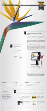
Prompted by a blog post by Khoi Vinh, I was introduced to a little site called CommandShift3 that pits website designs against each other. Having recently rebooted the Vine Type site, I thought I'd play along. Fast forward one month.
I guess folks liked the look of the Vine Type redesign, because they voted it best site for January 2008.
The Shock
I'm quite stunned. I'm not that good and the site is not fantastic. And I'm not trying to be humble here, I think my design aestheic is improving and the Vine Type site is good but, it's not A List Apart good or Clarke (http://malarkey.co.uk/) good or Shea good.
Okay, it might be better than a picture of a shoe and I put a lot of effort into it, so I'll just make my little acceptance speech and get it over with. I'd like to thank the inspiration for the reboot. Specifically,
Inspiration Details
All of the artwork is my original work but I drew from all of these sites in differnt ways. Of course grid design is inspired by and promoted by Khoi and Mark Boulton at SXSW. I used the default blueprint css framework to assist me in layout.
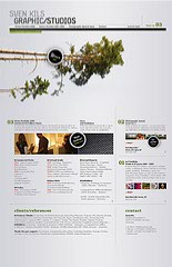
I've been struck with the beauty of Sven Kils site since I first saw it and I used the concept of a large graphic sprouting from the side of the page. I had intended to use something other than a gray background, but the flower is so colorful, a gray background seemed to be the right choice. I think I need to say here that I am a software developer and not formally trained in design. Everything I learned from books, blogs, SXSW, and internet tutorials.
The banners are a variation that Jonathan Snook uses and no one can enhance a page with little icons as well as Veerle Pieters.
The Shocking Truth
Okay, I'll let the astounding news out right here: no Adobe products were used in the creation of the Vine Type website. Not Photoshop. Not Illustrator. Not Fireworks. Not Dreamweaver. Nothing Adobe. Just these:
- Microsoft Expression Design
- Microsoft Expression Web
And I'm not ashamed to blog about why I am using Microsoft design products. My last three websites were created with Expression Suite exclusively and I am beginning to believe that I will not be going back to Photoshop.
Certainly Expression Design as a first-generation product needs some polishing, and of course as a photo manipulation product, Photoshop has no equal. But the Expression products are meeting my website creation needs very well, and they cost a lot less than stuff coming from Park Avenue in San Jose.
So as the music rises and I continue to ramble on, let me ask anyone out there: are you as surprised as I am that sites can be created without Adobe products?
Update 1 July 2008
I'd like to welcome visitors from the Microsoft Expression Studio website where Microsoft is currently featuring the Vine Type website in its Expression Gallery.
Once again, I'm honored and humbled by the recognition -- I am still a student of the craft and I'm thankful for your kind attention and encouragement.


Comments
Very nicely done, Carl! Congratulations!
I haven't used Expression Design. I do love Expression Web, though.
Thanks, Milan. Expression Design is great also. It takes a bit of time to get used to the vector-based paradigm. And there's extra work in lining stuff up since you can place things at a sub-pixel level, but I'm enjoying using it as my primary design tool.
In all fairness to the wonderful folks creating the software, it's not truly a first-generation product since it began life as Creature House Expression.
Congrats Carl, it's a well deserved honor.
Great job! Congrats!
Thanks Nathan. Thanks David. It feels great to have my work recognized by fellow website creators.